Every trade sells differently. So should every website.
A furniture workshop, a late-night bar and a consultancy. Someone choosing a kitchen and someone picking a bar at eleven at night are not doing the same thing, so every site gets built differently.
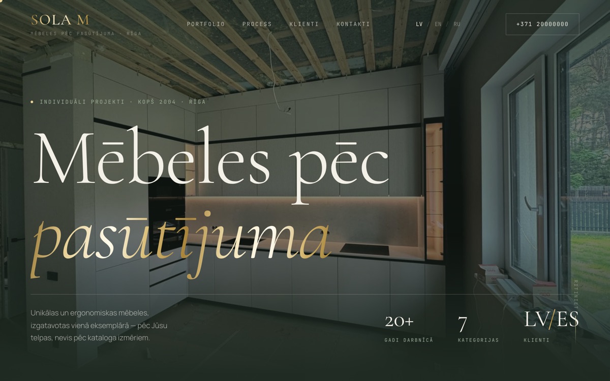
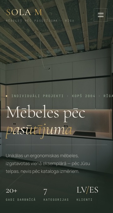
A furniture workshop sells one thing above everything else: proof that the last job was done well.
So the site has to show finished work large enough that you can see the joinery, in the language the customer speaks at home, and then make it easy to send a photo of a room and ask what something like that would cost. Most of these customers arrive on a phone, from Google or from a friend's recommendation, and they are comparing two or three workshops in the same week.
What the site does
- A portfolio filtered by room, so someone looking for a kitchen sees kitchens and not wardrobes
- A page that explains how a commission works, from the first measurement to delivery
- Latvian, Russian and English on one site, with the switcher in the header
- An enquiry form that asks which kind of furniture it is, then reaches the workshop directly
- Client logos on the home page, because in this trade the names carry weight
Nobody sits down at a desk to plan an evening.
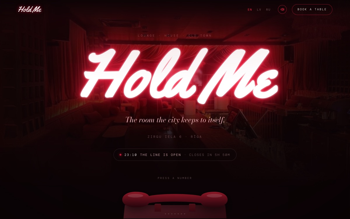
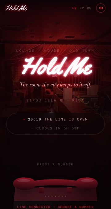
This one is read on a phone, in a dark street, about ten minutes before a group decides where to go. It has to load fast, stay legible at that size, and put a booking one tap away. A form with six fields loses that customer; a WhatsApp button does not. It also has to work for a Latvian, a Russian and a tourist reading the same page on the same night.
What the site does
- Keypad navigation, built for one thumb rather than a mouse
- Full menus, readable on a phone without pinching to zoom
- Booking straight into WhatsApp, with the message already started
- Hours and the map high on the page, where they get looked for
- Three languages, because the room has all three in it on a Friday
A consultancy has to sell something the customer cannot picture yet.
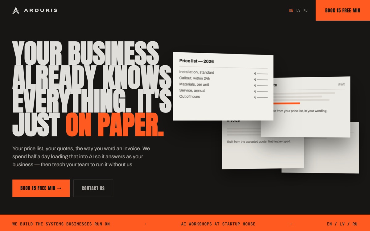
Nobody arrives here knowing what they want to buy. They arrive with a suspicion that their business is slower than it needs to be. So the page makes the abstract concrete — the price list, the quote and the invoice sit on the screen as things you can actually see — and then makes the first step small enough that nobody has to think about it. One page, read top to bottom, with the same call to action at the end of every section.

What the site does
- One page, top to bottom, with no menu to get lost in
- The offer stated once, plainly, near the top
- The work shown as objects on the page, not described in adjectives
- Latvian, Russian and English
- A first step small enough to say yes to, repeated at the end of every section
Nothing has been built yet, which is the whole problem.
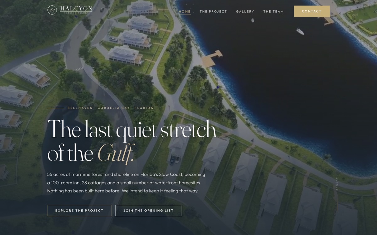
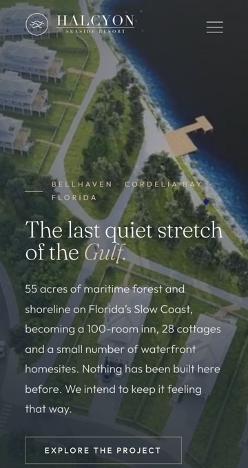
A resort that opens in two years has no photographs, no reviews and nobody who has been there. What it has is drawings, a plan and a piece of coast. The site has to make that feel real enough that a stranger hands over an email address, and it has to hold up on a laptop at a kitchen table, because that is where people decide whether a place is worth a flight.
What the site does
- Renders and a drawn masterplan doing the work photographs usually do
- Rooms, cottages and homesites each explained on their own terms
- A team page, because a development this early sells on who is behind it
- One action repeated throughout: join the opening list
- Seven pages that stay out of the way of the place itself
Your trade is not on this page yet.
Tell us what you do and we'll tell you what the site would need to do for it.